
A distribution describes which values a variable takes and how frequently those values occur. It cannot be summarized responsibly by reporting only an average. Shape, center, spread, unusual features, measurement units, and data context work together. Graphs reveal structures that numerical summaries hide, while calculations make comparisons more precise than visual impressions alone. Descriptive statistics is therefore a coordinated practice of representing, calculating, interpreting, and questioning data.
Learning objectives and a disciplined description framework
By the end of this lesson, you will distinguish cases from variables and categorical from quantitative data. You will select and interpret dotplots, histograms, boxplots, and relative-frequency displays. You will describe distributions through shape, center, spread, and unusual features in context. You will calculate and interpret mean, median, quartiles, IQR, variance, standard deviation, percentiles, and standardized values. You will also compare groups and investigate potential outliers without making unsupported causal or population claims.
A useful description framework asks four questions. What is the shape, where is a typical center, how much spread is present, and what unusual features require attention? Every answer should name the variable and its units. A distribution is about values of something measured on particular cases. Context turns a pattern into information.
The order of description matters less than completeness and coherence. Shape helps determine which center and spread summaries are representative. Center has little meaning without spread, and spread can differ despite equal centers. Unusual values may explain or distort both. The final description should read as one connected account rather than a checklist of isolated facts.
Identify cases, variables, and observational units
A case is an entity on which information is recorded. Depending on the study, a case might be a person, machine, city, transaction, day, or experimental run. A variable is a characteristic recorded on each case. The observational unit defines what one row of a data table represents. Ambiguity about cases can create invalid sample-size and independence claims.
Categorical variables place cases into groups or labels. Examples include material type, response category, and region. Quantitative variables record numerical amounts for which arithmetic has contextual meaning. Temperature, mass, time, and count are quantitative. Numerical codes used only as labels remain categorical despite containing digits.
Quantitative variables may be discrete or continuous. A discrete variable takes separated countable values, such as number of defects. A continuous variable can vary throughout intervals, such as measured length. Measurement precision may make continuous observations appear rounded or discrete. Variable type guides display and summary choices.
Match the display to the variable and question
Categorical distributions are commonly displayed with frequency tables, relative-frequency tables, and bar charts. Separate bars emphasize distinct categories. Quantitative distributions can use dotplots, stemplots, histograms, density plots, or boxplots. A scatterplot is for the relationship between two quantitative variables rather than one-variable distribution alone. Display choice should follow the analytical question.
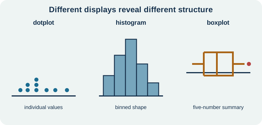
Dotplots preserve individual values and work well for small to moderate samples. Histograms group quantitative values into adjacent intervals called bins. Boxplots compress a distribution into quartile-based structure and highlight potential outliers. No single display reveals everything. Using two complementary displays can expose both global shape and individual cases.
Every graph needs a meaningful title, labeled axes, units, and readable scale. Frequency and relative frequency produce the same shape when denominators are consistent, but relative frequency supports groups of different sizes. Truncated axes can exaggerate differences in bar heights. Decorative effects should not obscure quantities. A graph is an argument about data and should make its construction visible.
Understand histogram bin choices
A histogram divides a quantitative axis into intervals and counts observations inside each interval. Bin width and starting boundary can change apparent modality, gaps, and smoothness. Very wide bins hide structure. Very narrow bins create noisy detail. Reasonable choices should be examined rather than accepted automatically.
Adjacent histogram bars touch because the horizontal axis represents a continuous numerical scale. A bar’s area or height corresponds to frequency under the chosen convention. Unequal bin widths require density scaling if area is to represent count. Ordinary frequency heights with unequal widths can mislead. Software defaults should be inspected.
Histograms discard case order. A time sequence that rises steadily and one that alternates can have identical histograms. If order matters, pair the histogram with a time plot. Likewise, a gap may reflect rounding, detection limits, or a genuine absent range. Graph features require contextual investigation.
Describe modality, symmetry, and skew
Modality counts prominent peaks or clusters in a smoothed descriptive sense. A distribution may be unimodal, bimodal, or multimodal. Multiple modes can indicate mixed subgroups, repeated processes, or simple sampling variation. The term depends somewhat on display resolution. Investigate rather than overstate weak bumps.
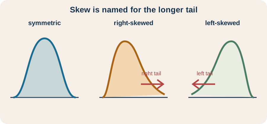
A symmetric distribution has roughly mirrored left and right sides around its center. A right-skewed distribution has a longer or thinner tail toward larger values. A left-skewed distribution has its longer tail toward smaller values. The direction of skew names the tail, not the location of most observations. Many learners reverse this language by focusing on the peak.
Shape descriptions should remain proportional to evidence. The word normal names a specific family of probability models, not a synonym for vaguely mound-shaped. A sample histogram cannot prove an exact population distribution. Say approximately symmetric or roughly bell-shaped when that is what the graph supports. Precise language prevents visual impressions from becoming unsupported model assumptions.
Find and interpret the mean
For observations , the sample mean is . The bar over denotes the arithmetic mean. Sigma adds all observations, and division by distributes the total evenly across cases. The mean has the same units as the observations. It can be interpreted as an equal-share value or balance point.
The mean balances signed deviations because . Values above the mean contribute positive deviations and values below contribute negative deviations. This identity follows from . It does not mean individual deviations are small. Large positive and negative values can cancel.
For data , the sum is and , so . The mean need not be an observed data value. It uses every magnitude and is therefore sensitive to extreme observations. That sensitivity can be useful when every total contribution matters, but it reduces resistance to outliers. The data context determines whether that sensitivity is desirable.
Find and interpret the median
The median is the middle value after observations are ordered. For odd , it is the single central observation. For even , it is commonly the mean of the two central observations. The median divides the ordered data so that at least half are at or below it and at least half are at or above it. Its position matters more than the magnitudes of extreme values.
For , the median is the third ordered value, which is . Replacing with leaves the median unchanged because the ordering around the middle stays the same. The mean changes dramatically. This resistance makes the median useful for skewed distributions and data with extreme values. Resistance describes limited sensitivity rather than complete immunity to data changes.
The median also has the original data units. It is not necessarily a typical case if the distribution is strongly bimodal. A value between two clusters may have no nearby observations. Center must therefore be interpreted alongside shape. One number cannot represent every distribution well.
Choose center based on shape and purpose
Mean and median answer related but different questions. The mean represents equal redistribution and uses every magnitude. The median represents ordered halfway position and resists extremes. In an approximately symmetric unimodal distribution without influential outliers, they are often close. In a skewed distribution, the mean is commonly pulled toward the longer tail.
For strongly right-skewed income data, median usually describes a typical position more robustly. Mean may still be important for total resource calculations because total equals . Neither summary is automatically correct in every context. State the purpose behind the choice. Reporting both can reveal asymmetry.
Center comparisons across groups should use the same summary and units. A five-unit difference can be large or small depending on within-group spread. Sample sizes and distribution shapes also matter. Avoid calling a group generally higher based only on one statistic when distributions overlap heavily. A comparison should integrate center, spread, shape, and unusual features.
Measure spread with range and interquartile range
Range is maximum minus minimum. It is simple but depends only on two observations and is highly sensitive to extremes. Interquartile range is . The first quartile marks roughly the 25th percentile, and the third quartile marks roughly the 75th percentile. IQR measures the width of the middle half of the ordered data.
Quartile calculation conventions differ slightly between software and textbooks, especially for small samples. State or follow the course convention consistently. Small endpoint differences rarely alter the broad interpretation but can change an outlier flag. For large samples, common conventions usually converge closely. Reproducibility requires documenting the method when exact quartiles matter.
Median and IQR form a resistant pair. They are less affected by a few extreme values than mean and standard deviation. Range can supplement them by showing full observed extent. However, a small IQR can coexist with extreme tails. Report enough structure to match the question.
Derive variance and standard deviation
Deviations from the mean sum to zero, so simply averaging signed deviations cannot measure spread. Squaring deviations makes every contribution nonnegative and weights large distances more strongly. Sample variance is . The denominator is the sample degrees of freedom after estimating the mean. Under random sampling, it makes unbiased for population variance in the classical setting.
Sample standard deviation is . The square root returns the measure to original data units. If observations are in centimeters, variance is in and standard deviation is in . Standard deviation describes a typical scale of distance from the mean, though it is not usually the simple average absolute distance. It is nonnegative and equals zero only when all observations are identical.
For , deviations from mean four are . Squared deviations sum to . Sample variance is , and standard deviation is . The large value ten contributes thirty-six of the fifty-four squared units. Squaring reveals why standard deviation is nonresistant.
Interpret standard deviation carefully
Standard deviation is best paired with the mean because both use every observation and are sensitive to extremes. It measures spread around the mean rather than around the median. Adding a constant to every observation shifts the mean but leaves standard deviation unchanged. Multiplying every observation by constant multiplies standard deviation by . Units and transformations follow these rules.
For approximately normal distributions, the empirical rule gives useful benchmarks. Roughly of observations lie within one standard deviation of the mean, within two, and within three. These percentages are not universal laws for arbitrary distributions. Strong skewness or heavy tails can produce very different fractions. State the shape assumption before invoking the rule.
Chebyshev’s inequality gives broader guarantees for any distribution with finite variance. At least of values lie within standard deviations of the mean for . The guarantee is conservative because it covers many shapes. For , at least lie within two standard deviations. Do not confuse this general bound with the normal-model guideline.
Use five-number summaries and boxplots
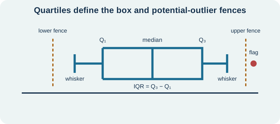
The five-number summary consists of minimum, , median, , and maximum. It organizes location and spread through ordered positions. A boxplot draws a box from to , a line at the median, and whiskers according to a stated rule. Modified boxplots commonly stop whiskers at the most extreme nonflagged values. Potential outliers are plotted separately.
Boxplots support compact group comparison. Differences in medians, IQRs, skew, and flagged observations can be seen side by side. They do not reveal every mode, gap, or exact sample size unless those features are added. Equal-looking boxes can hide different internal distributions. Pairing boxplots with jittered points or histograms can restore detail.
The box width sometimes encodes sample size, but often it does not. Notches may represent an approximate median uncertainty interval under specific definitions. Visual conventions vary across software. Read the legend or documentation before interpreting extra features. A boxplot is a designed summary rather than a miniature raw-data graph.
Flag possible outliers with the IQR rule
The common lower fence is and upper fence is . Observations below or above those fences are flagged as potential outliers. The multiplier is a convention, not a universal law of error. Fences are thresholds on the measurement scale. Values beyond them deserve investigation.
A flagged observation may be a data-entry error, unusual but valid case, different subgroup, or evidence of a heavy-tailed process. Automatic deletion can bias analysis and erase important phenomena. Check source records, measurement conditions, and sensitivity of conclusions. If a value is corrected or excluded, document the reason. Statistical unusualness is not proof of invalidity.
The IQR rule behaves differently across sample sizes and distributions. Large samples from a long-tailed distribution may naturally produce many flags. Small samples may fail to flag an influential point. Subject knowledge and graphical analysis remain necessary. Outlier rules begin questions rather than settle them.
Interpret percentiles and standardized position
The th percentile is a value at or below which approximately of observations fall under the stated convention. A percentile describes relative position rather than the percentage of questions answered correctly or amount above the mean. The median is the 50th percentile. Quartiles correspond roughly to the 25th and 75th percentiles. Ties and interpolation conventions can affect exact ranks.
A standardized value or -score is for a population or an analogous sample formula. The numerator is signed distance from the mean, and division by standard deviation expresses that distance in standard-deviation units. A positive lies above the mean and a negative lies below. A value is two standard deviations above the mean. The score is dimensionless because units cancel.
A large absolute -score does not automatically prove rarity. Rarity depends on distribution shape. In a normal model, tail probabilities can be connected to , but heavy-tailed data produce extreme standardized values more often. Standardization supports comparison across scales when the distributions are meaningfully comparable. It does not erase contextual differences.
Compare distributions rather than isolated statistics
A strong comparison uses comparative language throughout. Instead of writing two separate descriptions, say one group has a higher median, smaller IQR, stronger right skew, or more unusual high values than the other. Attach units and approximate numerical evidence. Note similarities as well as differences. Comparison should address the same variable measured under comparable conditions.
Relative-frequency displays are important when group sizes differ. Raw counts can make a larger group look more prevalent in every bin simply because it contains more cases. Percentages place groups on a common denominator. Sample size should still be reported because smaller groups produce noisier shapes. Standardized displays do not make uncertainty identical.
Overlapping distributions can have different centers, and equal centers can accompany very different spreads. A statistically significant difference can coexist with substantial individual overlap. Descriptive comparison alone does not establish population differences or causal effects. Sampling and experimental design determine the scope of inference. Keep observation separate from generalization.
Describe transformations of data
Adding constant to every observation adds to mean, median, quartiles, and extrema. It leaves range, IQR, variance, and standard deviation unchanged. Multiplying every value by positive constant multiplies center and spread measures by , while variance multiplies by . Negative multiplication also reverses order, so quartile labels interchange appropriately. Standard deviation scales by .
Unit conversions follow these rules. Converting meters to centimeters multiplies every length by one hundred, so mean, median, IQR, and standard deviation multiply by one hundred. Variance multiplies by ten thousand and changes from square meters to square centimeters. Standardized -scores remain unchanged under positive linear unit conversions. Dimensionless position survives rescaling.
Nonlinear transformations can change shape. A logarithm often compresses large right-tail values and may make multiplicative patterns easier to see. Square roots can stabilize some count-data spreads. Transformed summaries must be interpreted on the transformed scale or carefully returned to original units. A transformed mean does not generally back-transform into the original mean.
Avoid unsupported conclusions from descriptive data
A descriptive graph summarizes observed cases. It does not by itself justify inference to a broader population. Random sampling or a defensible sampling model supports generalization. A convenience sample may have a beautifully described but unrepresentative distribution. Scope comes from design, not graphical polish.
An association or group difference does not establish causation. Random assignment and control of confounding support causal inference in experiments. Descriptive displays can generate hypotheses and reveal patterns worthy of study. They cannot rule out alternative explanations alone. Wording should match the design.
Missing data, measurement limits, and data cleaning can shape a distribution. A spike at zero may be meaningful, censored, or a coding convention. Rounded values can create artificial heaps. Combining subgroups can create multimodality or obscure within-group patterns. Ask how the data were produced before narrating their shape.
Verify descriptive calculations and displays
Begin with the cases, variable definition, units, sample size, and missing-value rules. Sort or inspect raw values and calculate basic counts. Choose displays suited to variable type and question. Compare more than one bin choice for histograms. Label every axis and denominator.
Next compute center and spread with transparent formulas or verified software. Check that the mean lies within the observed range and the standard deviation is nonnegative. Confirm the median and quartiles from ordered data. Track squared units for variance and original units for other summaries. Recalculate after any data correction.
Finally integrate graph and numbers. Ask whether the chosen summaries match shape and unusual features. Compare groups with common scales or relative frequencies. Investigate flagged cases and record decisions. Write a contextual conclusion that distinguishes observed description from population or causal inference.
Diagnose common mistakes
One mistake reports center without spread. Two groups with equal means can have radically different variability and risk. Another uses mean and standard deviation for strongly skewed data without discussion. Pair summaries with shape. Explain why a measure is representative.
Another mistake calls every mound-shaped graph normal. Normality is a model with specific probability structure. A sample display can be approximately consistent with that model without proving it. Quantile plots and context provide additional evidence. Use careful qualifiers.
Outlier mistakes include automatic deletion and automatic retention without investigation. Both ignore the data-generation process. Histograms also do not display time order, and bar charts should not be used as continuous histograms. Match claims to the information actually visible. Descriptive statistics rewards disciplined restraint.
Practice description, calculation, and comparison
For data , calculate mean, median, range, sample variance, and sample standard deviation. Then replace ten with eighty and recompute mean and median. Explain resistance using the changes. State units if values are measured in centimeters. Choose a representative center and spread after replacement.
An income distribution is strongly right-skewed with several valid high values. Choose appropriate center and spread summaries and explain why. Describe how mean likely compares with median. State what a boxplot would show and what it might hide. Explain why flagged high values should not be deleted automatically.
Two classes have the same median test score of points. Class A has IQR points and Class B has IQR points. Write a comparative description that does not claim causation or population generality. State what additional graph features you would inspect. Explain why equal medians do not make the distributions equivalent.
Solutions and reasoning
For , mean is , median is , and range is . Squared-deviation sum is , so sample variance is and standard deviation is approximately . Replacing ten with eighty gives mean while the median remains two. The mean is nonresistant because every magnitude enters its sum. The median is resistant because its middle order position does not change.
For strongly right-skewed income, median and IQR provide resistant summaries. Mean is commonly above median because large high-tail values pull the balance point rightward. A boxplot highlights median, middle-half spread, skew indications, and flagged values. It may conceal multiple modes, exact gaps, and sample-size detail. High values should be checked for validity and substantive meaning before any exclusion.
Class A and Class B have equal observed medians, but Class B’s middle half is three times as wide. Class A is therefore more concentrated around its median by the IQR measure. Histograms or dotplots could reveal skew, clusters, gaps, and unusual cases hidden by the two summaries. Sample sizes and data-collection methods are also needed. The observed comparison alone does not establish why the classes differ or whether broader populations do.
Carry descriptive reasoning into inference
Describing distributions is the first stage of statistical analysis, not a preliminary chore to skip. Shape guides summary choice, center and spread quantify different aspects, and unusual features prompt investigation. Context and units turn calculations into meaning. Multiple representations protect against the blindness of any single summary. A responsible description makes the data-generating process visible when possible.
Sampling and experimental design determine whether observed patterns can support population or causal claims. Probability models describe how statistics vary across samples. Confidence intervals and hypothesis tests build inference on that sampling behavior. Regression extends distributional reasoning to relationships and residuals. Every later method assumes that the analyst can first see and describe the data honestly.
When reporting a distribution, name the variable, cases, units, shape, center, spread, and unusual features. Explain why the chosen summaries fit the shape and purpose. Compare groups directly and investigate anomalies. Then state the limits imposed by design. That complete account is more informative than any solitary average.